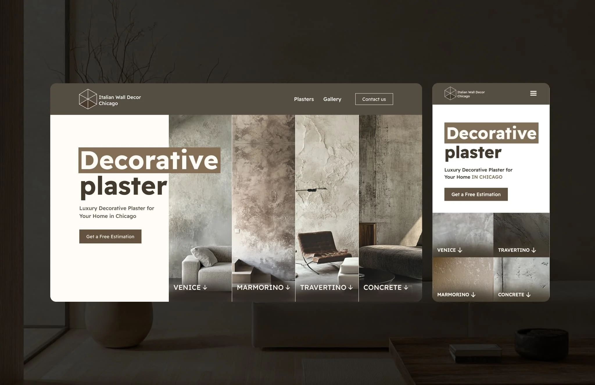
Italian Wall Decor
Making Decorative Plaster Understandable and Desirable
Role: UX/UI designer
Team:
UX/UI designer
Webflow developer
Tool: Figma, FigJam
Overview:
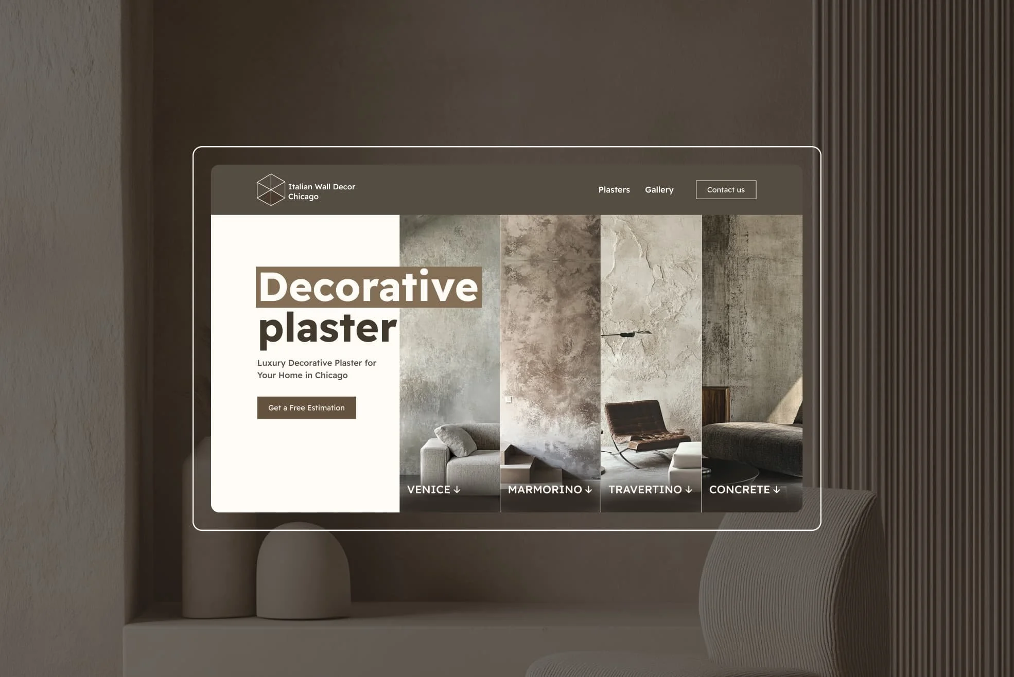
When IWD approached me, they were just getting started. A new company based in Illinois, they specialized in a niche, beautiful, but often misunderstood service: decorative plaster. Their passion for craft was undeniable—but there was a clear gap between the quality of their work and how the market perceived it.
My job was to help bridge that gap.

Problem:
Most people don’t wake up thinking, “I want decorative plaster in my house.” They often don’t even know it’s an option.
This meant we weren’t just solving for “how do we get people to hire us?”—we were solving a much deeper UX problem:
How do we help someone understand what this material is, visualize it in their own home, and want it—enough to reach out?
This became the core design challenge.
Solution:
To solve this, I designed and developed a conversion-focused landing page that had three clear goals:
Educate visitors about decorative plaster—what it is, where it can be used, and what makes it special
Inspire through a visual portfolio that showed real, completed projects
Convert with a clear and inviting contact form that felt accessible, not intimidating
But that was just one part. We also needed to build a modern, recognizable brand identity—one that felt professional but artisanal, trustworthy but creative.
Research:
Before designing anything, I spoke with several homeowners, interior designers, and even general contractors. I wanted to understand:
What do people think when they hear “decorative plaster”?
What makes them hesitate to contact a service-based business online?
What kind of visual style feels high-end but warm?
Insights:
Most people confuse decorative plaster with outdated stucco or faux paint finishes
They needed to see examples in context—close-ups weren't enough
A clean, modern aesthetic was perceived as “more trustworthy” in this niche
I also looked at competitors and found that most had outdated websites with poor photography, unclear messaging, and generic branding. This was a huge opportunity for Italian Wall Decor to stand out.
Ideation & UX Design:
The UX strategy had to do more than guide—it had to educate, reframe, and inspire.
I started by mapping out a clear, intentional user journey:
Land → Learn → Explore → Trust → Contact
This became the basis for the sitemap, and from there, I created low-fidelity wireframes to define the structure and flow. Every screen was built to answer a specific user question:
What is decorative plaster?
How does it look in real spaces?
Is this company trustworthy?
What’s the next step?
The wireframes focused on narrative flow—each scroll felt conversational, revealing just enough to pull the user deeper.
I prioritized clarity and simplicity: minimal navigation, focused layouts, and a consistent rhythm throughout the page.


Once the structure was solid, I layered in subtle but meaningful microinteractions—smooth scrolling, image transitions, hover states—that made the experience feel refined and tactile, without overwhelming the content.
This UX foundation made the final website feel less like browsing a company and more like discovering a craft.
UI design:
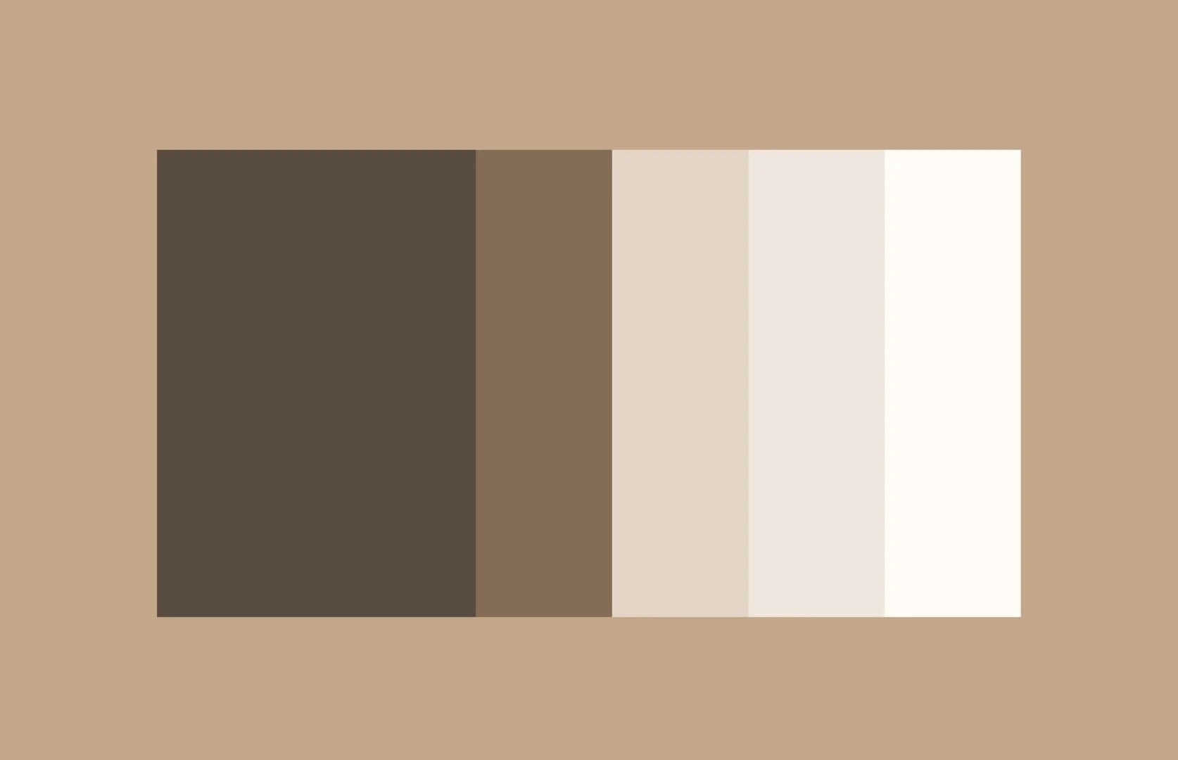
We crafted a unique brand identity inspired by natural textures and neutral tones.
The color palette used soft earth colors—clay, ivory, charcoal—to reflect the material itself.
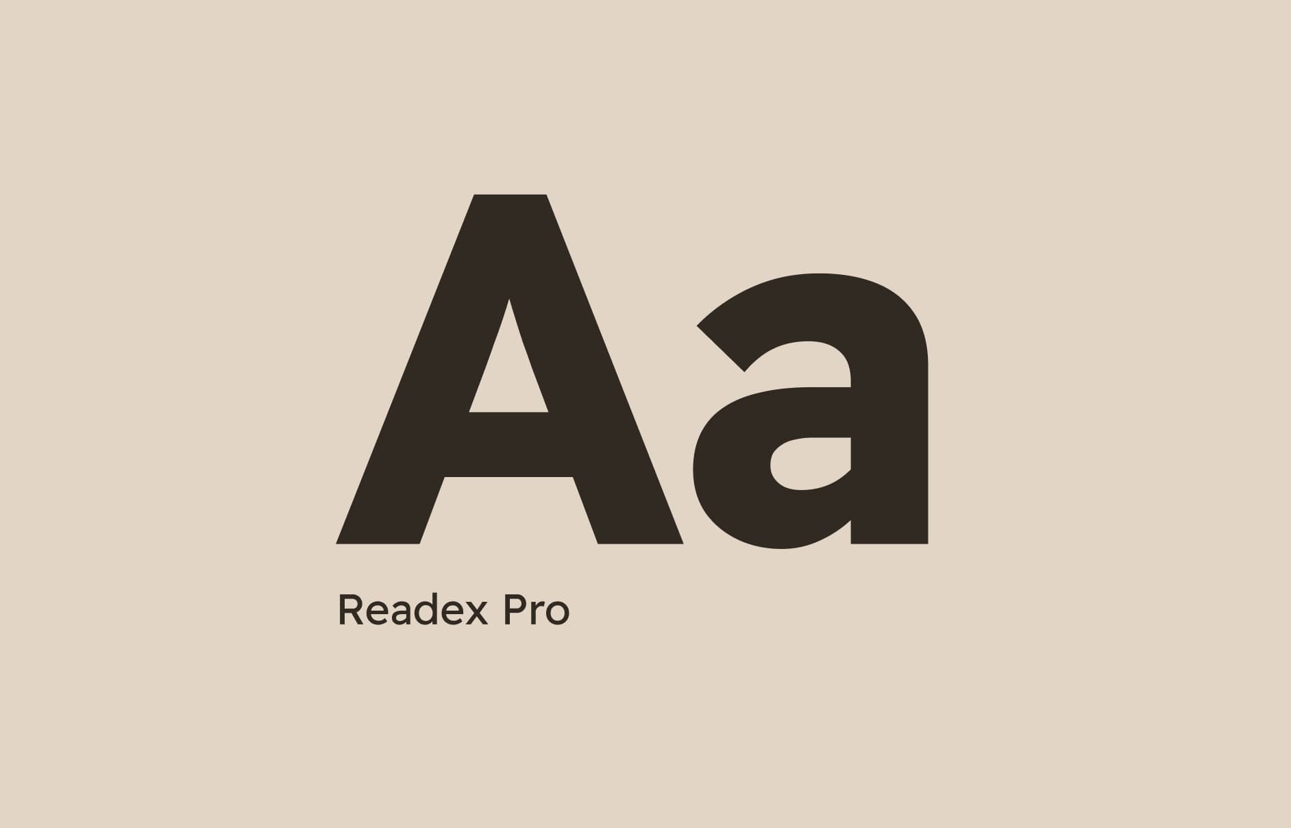
Typography was selected for elegance and readability. I used serif headers for sophistication and clean sans-serif for body text.
The UI leaned heavily on large photography—because with a physical, tactile product like this, seeing is believing.
I added subtle transitions and hover states to enhance interactivity without taking away from the content.
The final result felt modern, premium, and trustworthy—exactly what we needed.
Prototyping & Testing:
I created a responsive prototype in Figma and tested it with 4 people from our target audience group.
Feedback highlights:
“Now I actually get what decorative plaster is.”
“The examples make me want to try it in my kitchen.”
“The contact form feels simple—I’d probably fill it out.”
This confirmed we were heading in the right direction.

Reflection:
This project reminded me why I love what I do. It’s not about pixels—it’s about solving real problems.
What went well:
We turned an unfamiliar service into a compelling offering
The brand stood out immediately in a crowded, outdated niche
Within the first month of launch, IWD received multiple serious inquiries
What I’d do differently:
Add more storytelling around specific projects to deepen connection
Introduce a blog or FAQ section for SEO and ongoing education
What I learned:
That sometimes, design is about shaping desire—helping people imagine a better version of their space, and giving them the confidence to take the next step. By combining clear education, bold visuals, and accessible UX, we didn’t just launch a website. We helped launch a vision.
