Keating
Boosting International Education with AI
Role: UX designer
Team:
Project manager
UX designer
UX writer
Dev team
Tool: Figma, FigJam
Overview:
Keating is a bold new startup with a mission that resonated with me right away: supporting international students preparing for high-stakes language exams like TOEFL and IELTS, teachers and test administrations. As someone who also navigated the challenges of studying and working in a second language, I understood the pressure these students face—and saw the potential for technology to truly make a difference.


Problem:
Keating faced 2 major challenges:
As a new product in a crowded space, few people knew about it—and even fewer understood its unique value.
Lack of users: Without active beta testers, the product couldn’t evolve through real feedback. Growth was stuck.
This wasn’t just a visibility issue—it was a trust issue.
For international students, time is precious. Before they sign up for yet another “AI-powered” tool, they need to know it’s worth their attention.
Solution:
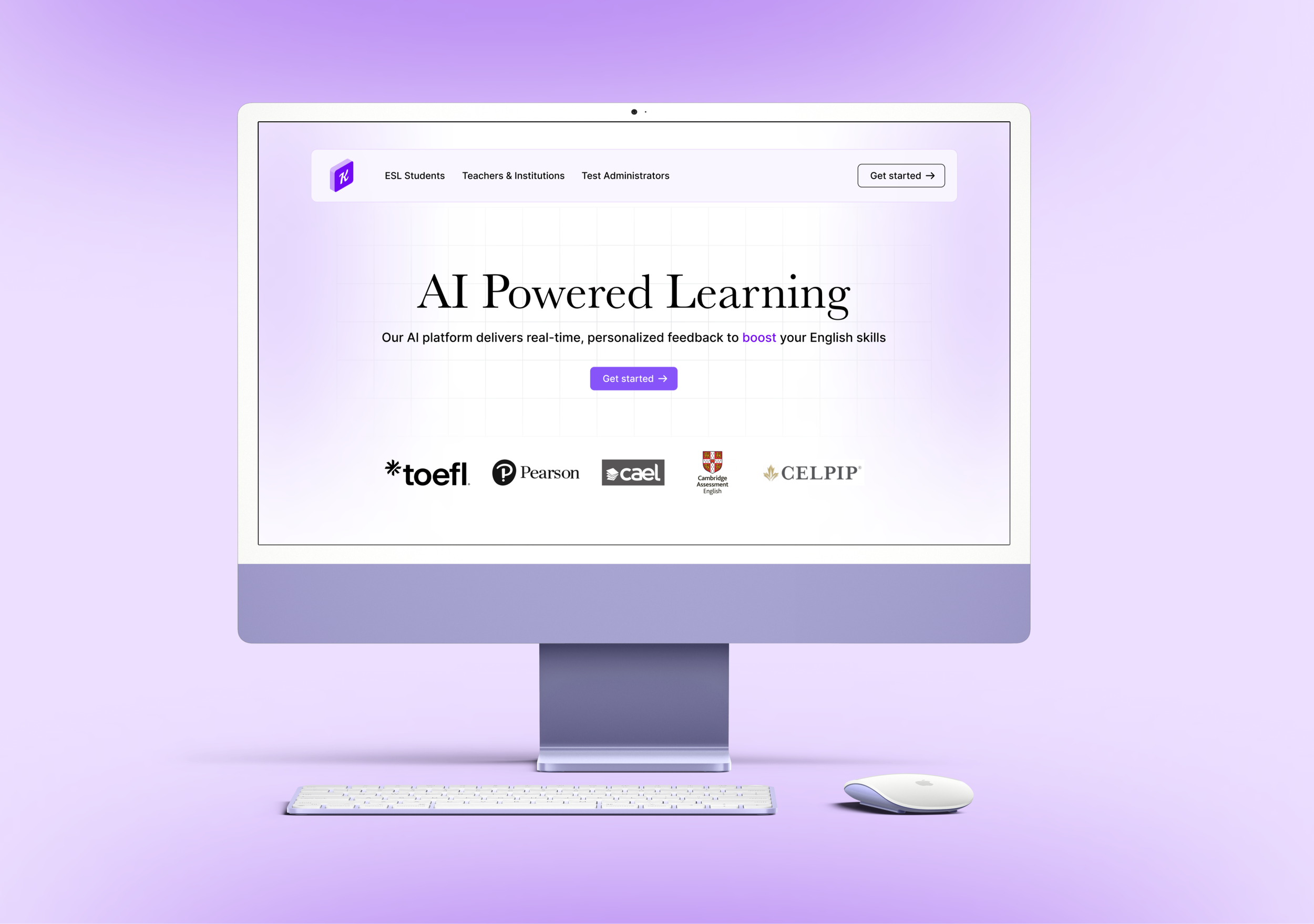
I proposed and designed a simple, focused website with one clear goal: get users to try the beta version.
The site would:
Clearly explain what Keating does and who it’s for
Highlight the real-life struggles (and how Keating helps)
Use social proof and clear visuals to build credibility
Make it ridiculously easy to sign up for the beta
The CTA was central: “Try Keating Beta Today”—visible on every scroll, with no distractions.
Research:
With limited time and resources, we took a lean approach. I started with lightweight interviews—talking to 5 international students preparing for TOEFL or IELTS. I asked questions like:
What tools are you currently using?
What frustrates you about them?
What would make you trust a new tool?


We also analyzed landing pages from language edtech competitors. Many were bloated with features or too vague.
We decided to go the opposite way: short, clean, and sharply focused on user needs.
Ideation & UX Design:
Once we gathered insights from user interviews, I moved into shaping the experience with one goal in mind: get users from curiosity to signup—fast and confidently.
I began by mapping out the user flow based on real behaviors and needs:
Discover → Learn → Trust → Try Beta
This flow directly informed the site architecture, which I sketched in FigJam:
Home → How It Helps → Product in Action → Why Keating → Beta Signup
Wireframes helped us align on layout, especially on mobile-first structure (since most students browse on phones). Each section was built to minimize overwhelm and guide users to action.


We tested wireframes with a few students and teachers. Feedback showed the journey felt intuitive and motivating—users knew what Keating was, why it mattered, and how to try it in just a few scrolls.
By focusing on clarity and flow, we turned a simple landing page into a powerful first touchpoint for the brand.
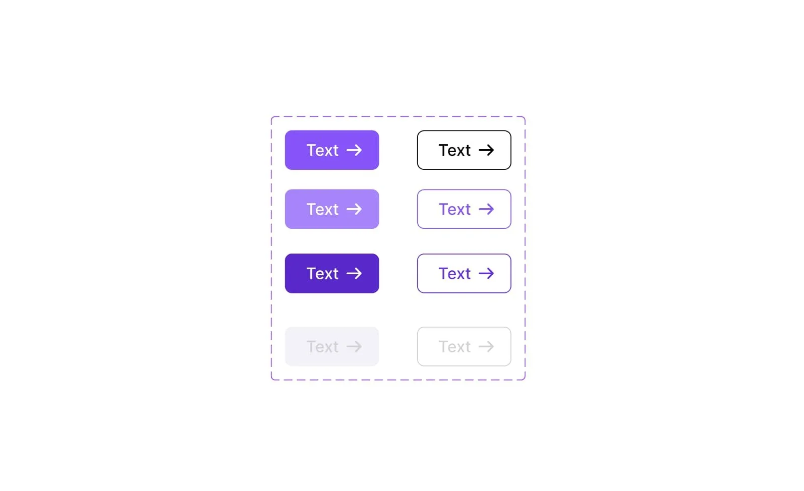
UI design:
Visually, Keating needed to stand out from both dull academic brands and flashy AI gimmicks. I chose a color palette with soft purples - professional, but welcoming.
Rounded edges and gentle gradients gave the site a sense of calm confidence.


Typography was kept readable and friendly—no cold, corporate fonts.
CTAs were placed thoughtfully, always above the fold and at key scroll moments.
The product screenshots were paired with short explanations. No walls of text—just quick clarity.


Prototyping & Testing:
I created an interactive prototype in Figma and tested it with our original interviewees.
I asked:
“Do you trust this tool?”
“Would you sign up for this?”
“What’s missing or confusing?”


What we learned:
The beta CTA was clear and motivating
Testimonials would improve trust even more (added a “Coming soon” section)
The site needed localized versions in the future—many students weren’t native English speakers
We launched with English only, but designed the site to support multilingual expansion easily.
Reflection:
What went well:
The site launched quickly, and within 2 weeks, Keating saw a noticeable spike in beta signups
The clear messaging helped us stand out in a competitive space
What I’d do differently:
I’d integrate more social proof earlier—testimonials or expert endorsements
I’d explore adding a live chatbot or calendar link for one-on-one walkthroughs
What I learned:
That in early-stage startups, the role of a designer goes beyond pixels. It’s about building trust, communicating clearly, and designing for momentum. This wasn’t just about promoting a product—it was about helping people believe in it.


