BMB Kislitsa Construction
Building a Brand Through Thoughtful UX
Role: UX/UI designer
Team:
UX/UI designer
Front-end developer
Back-end developer
Tool: Figma, FigJam
Overview:
BMB K Construction is a small remodeling company based in Washington State, known for reliable work in home renovation and repair. Despite their solid reputation, they had no online presence or recognizable brand identity.
To grow and compete locally, they needed more than just a website—they needed a digital platform that reflected their value and helped drive business. That’s where I came in.


Problem:
The core issue was lack of visibility and trust. Potential clients didn’t know the company existed, and even referrals had nowhere to learn more or get in touch easily.
Internally, there was no system to handle inquiries—everything was manual and inconsistent. BMB K didn’t just need a website—they needed a tool that could attract, inform, and convert users around the clock.
Solution:
My proposed solution was more than just a website—it was a strategic platform that could position BMB as a trustworthy, modern construction company.
One of the key ideas was an interactive questionnaire. Instead of a typical “Contact us for a quote” form, I designed a custom flow that lets users describe their project in detail and get an estimated cost right away. This not only created a smoother experience for potential clients, but also helped the business filter and prioritize high-quality leads.
This was the turning point—the place where design started solving real business problems.
Research:
To ensure we weren’t designing in a vacuum, I conducted several short interviews with people who had recently remodeled their homes. I wanted to understand what their journey was like, what made them choose a contractor, and what frustrated them.
Some patterns became clear:
People wanted clear pricing and timelines.
They were overwhelmed by vague offers and lack of details on most contractor websites.
Trust and professionalism were the top decision-making factors.
In parallel, I reviewed the websites of competitors in the area. Most of them were outdated, hard to navigate, or didn't feel reliable. That gave us a real opportunity to stand out through both visual clarity and functional design.
I turned these insights into two user personas:
A middle-aged homeowner looking for a quality remodeling partner.
A younger couple focused on budget and looking for guidance.
These personas informed everything that followed.
Ideation & UX Design:
With a solid understanding of our users, I started mapping out the experience. My focus was on simplicity and clarity—making it easy to understand what BMB offers, and even easier to take action.
Using FigJam, I sketched out a sitemap that reflected the user’s natural flow:
Home → Services → Questionnaire → Estimate → Contact.


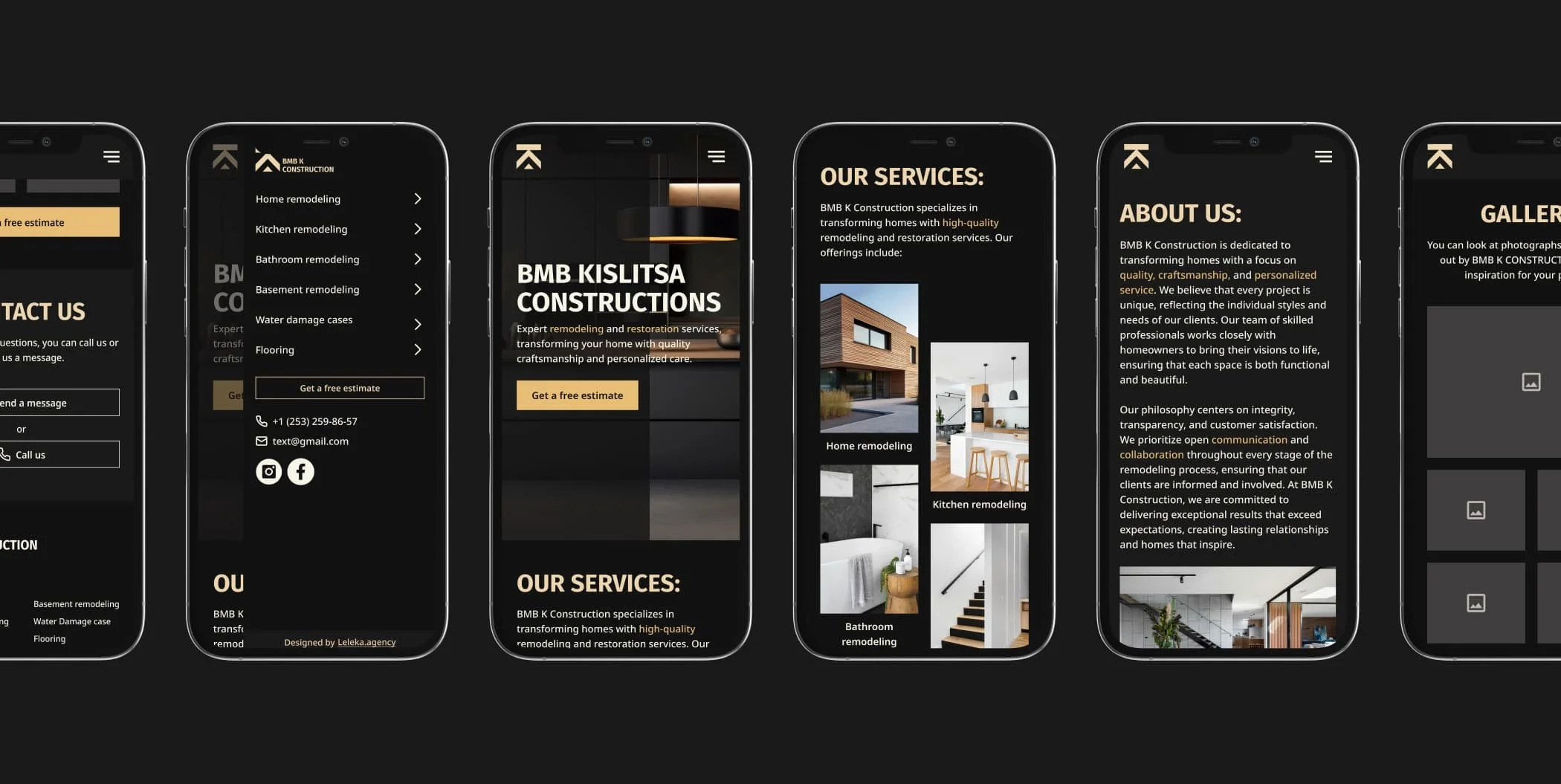
Wireframes helped test the structure quickly. I placed extra attention on the estimate flow—it needed to feel like a helpful tool, not a long, annoying form. I cut unnecessary steps, grouped questions smartly, and added progress indicators to guide the user.


The website wasn’t just informative—it was interactive and conversion-focused by design.
UI design:
When moving to UI, I wanted to reflect the tone of the business: solid, trustworthy, and down-to-earth. I chose a dark, natural color palette inspired by construction materials—deep earthy tones balanced with warm grays, and used beige shades as subtle accents to soften the look without losing strength.
Accessibility was a key priority throughout the design process. I carefully selected high-contrast colors to ensure readability and chose Fira Sans for headings and Noto Sans for body text—both clean, modern, and highly legible across devices and screen sizes.


I built a mini design system for the project in Figma: reusable components, consistent text styles, buttons with strong contrast for accessibility.


I also made sure the site was responsive from the beginning—many users would be on their phones during work hours or commutes.
Prototyping & Testing:
With the high-fidelity prototype ready, I invited a small group of users (both previous interviewees and new testers) to try the site. I asked them to imagine they were planning a remodel and go through the estimate form.

What I learned:
Users appreciated how easy the questionnaire was to complete.
One user even said, “It feels like someone’s walking me through it—not just asking for info.”
I made a few final tweaks, like changing field labels and improving feedback when the form was submitted.
The site now felt ready—not just visually polished, but genuinely useful.
Reflection:
This project reminded me why I love what I do. It’s not about pixels—it’s about solving real problems.
What went well:
The questionnaire was a game-changer for both users and the business.
The site feels trustworthy and modern, and most importantly—it works.
What I’d improve next time:
I’d integrate analytics from day one to track form submissions and engagement more closely.
I’d also explore adding a scheduling tool for consultations, directly after the estimate flow.
What I learned:
That even a small company can feel big with the right design strategy—and that good UX isn’t about making things pretty, it’s about making things work better for people and business alike.