Love of Christ Church
Bridging Faith and Modern Media
Role: UX/UI designer
Team:
UX/UI designer
UX writer
Front-end developer
Back-end developer
Tool: Figma, FigJam
Overview:
When I first started working with Love of Christ Church (or simply LH), I was struck by their deep compassion and active role in humanitarian work. Based in Ukraine, LH is a small but powerful community with one clear mission: to share the love of Jesus with as many people as possible.
But in today’s digital world, even the most heartfelt mission needs modern tools. LH understood this—and asked a bold question: How do we reach a new generation that spends most of its life online?

Problem:
The church came to me with several interconnected problems.
First, they lacked a digital space that truly represented their heart and their work. Information about events, services, and beliefs was scattered, inconsistent, or simply unavailable online.
Second, they faced a deeper cultural challenge: spiritual confusion. In a world full of denominations and religious noise, many people—especially the younger generation—don’t know whom to trust or how to ask questions without fear of judgment.
Third, they were losing the attention of a generation that lives in smartphones, scrolls quickly, and expects clarity. LH was doing amazing things on the ground, but online? They were nearly invisible.
Solution:
The solution was more than just a website—it was a strategic digital presence designed to connect with people where they are.
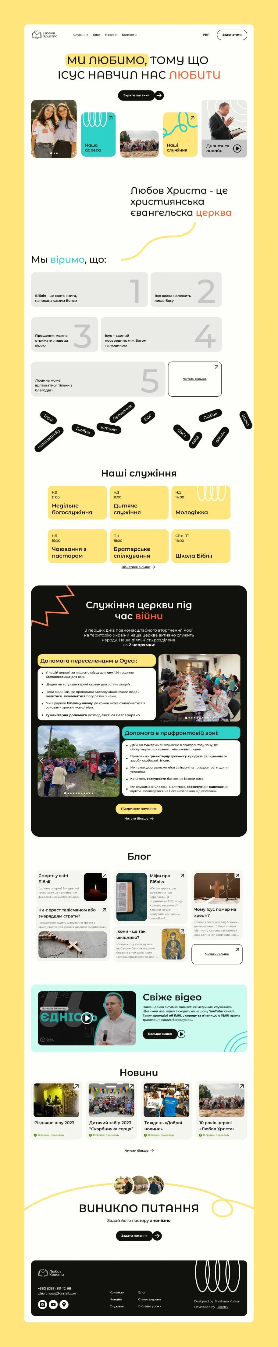
We built a clean, responsive site that became the central hub for all church communication.
Key features included:
An anonymous Q&A tool to create a safe space for spiritual questions
A blog and media section for sermons, stories, and updates
Clear sections for ministries, values, and events
Beyond the website, we also planned to grow the church’s social media presence on Instagram, TikTok, and Facebook—reaching younger audiences through familiar, engaging formats.
By combining thoughtful UX with a broader digital strategy, we helped the church not only share information - but build real, lasting connections online.


Research:
Before jumping into design, I wanted to understand two key groups:
1. Current members who loved the church but were often unsure where to find updates.
2. New visitors or spiritually curious individuals who might be hesitant to walk into a church without knowing what to expect.
I used a mix of surveys, interviews, and informal conversations. One surprising insight came up again and again:
“I have questions about faith, but I’m afraid to ask them in person.”
That statement alone shaped a core feature of the website—the anonymous “Ask a Pastor” tool. It created a safe space for curiosity and vulnerability—something that digital platforms are uniquely able to provide.
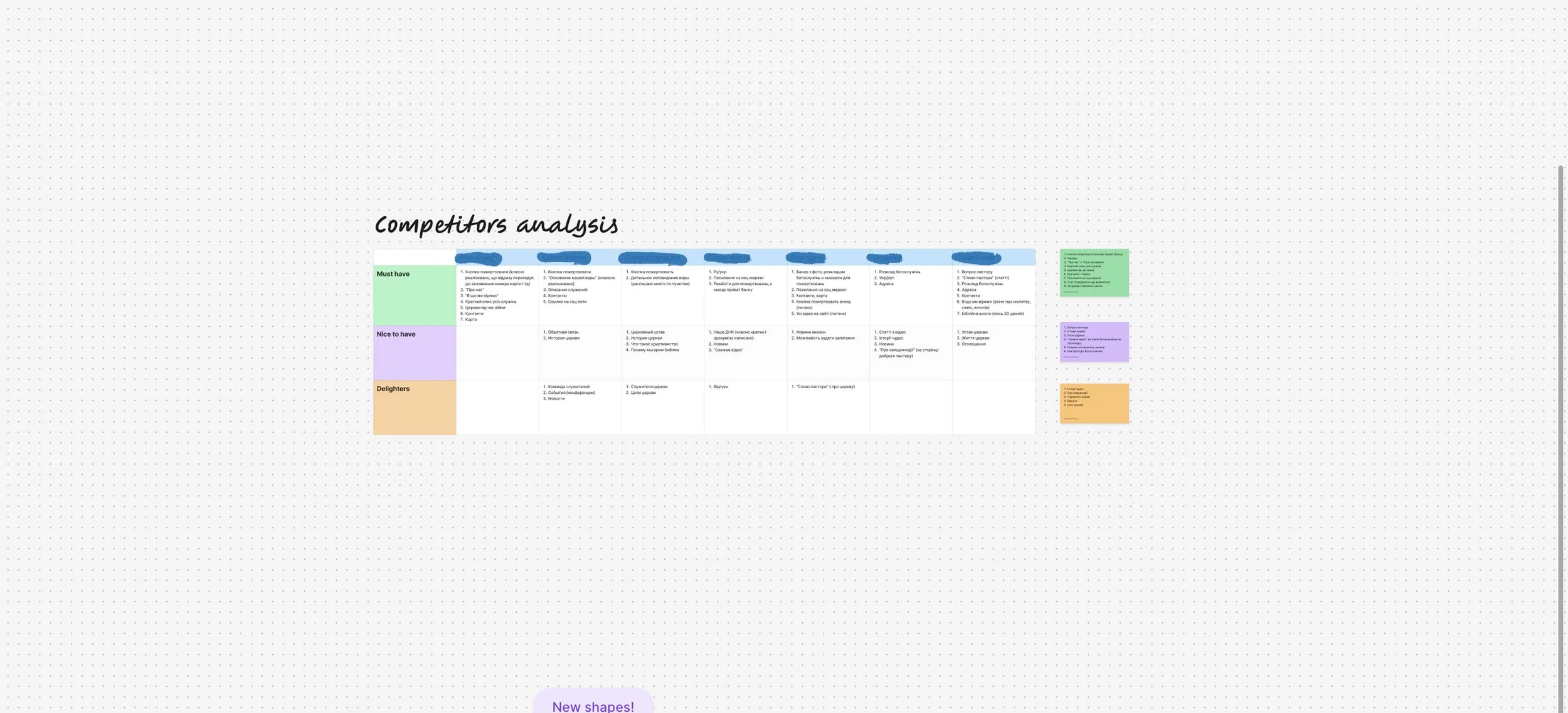
I also analyzed the websites of other churches and ministries. Many were outdated, slow, or too complex.
I knew LH could stand out with simplicity, warmth, and transparency.
Ideation & UX Design:
Translating insights into action began with mapping user flows that reflected real emotional and informational needs. I sketched out every path a visitor might take—from exploring the church's mission to asking deep, personal questions about faith.
The sitemap was simple:


Wireframes helped visualize how people would move through the site—from discovering the church to asking questions, watching a sermon, or joining a service.


Component design in Figma for reuse across the site (question cards, loading states, confirmation messages, etc.)
Microinteractions that confirm a message was sent without making it feel transactional, etc.
One of the most delicate experiences to design was the anonymous Q&A form. It had to:
Build immediate trust
Invite vulnerability without awkwardness
Feel personal, not transactional
I ideated multiple approaches in FigJam—chat-like formats, modal popups, embedded sections—and tested each for tone and usability.
After user testing, I landed on a minimalist form with soft onboarding language like:
“Got a question about life or faith? Ask anything—no names, no pressure.”
To reduce hesitation, I removed friction points: no login, no email, no captcha. The entire interaction had to feel more like a conversation than a submission.

UI design:
The visual design had to feel faith-based yet modern.
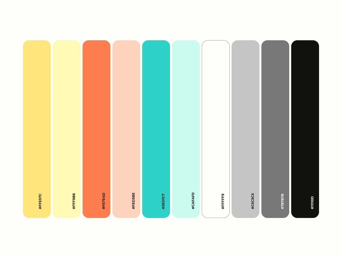
We focused on accessibility from the start—using a bright palette with strong contrast, clean white backgrounds, and intuitive spacing.
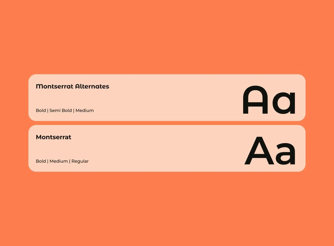
Typography was chosen for clarity and tone: Montserrat for body text and Montserrat Alternates for headings.
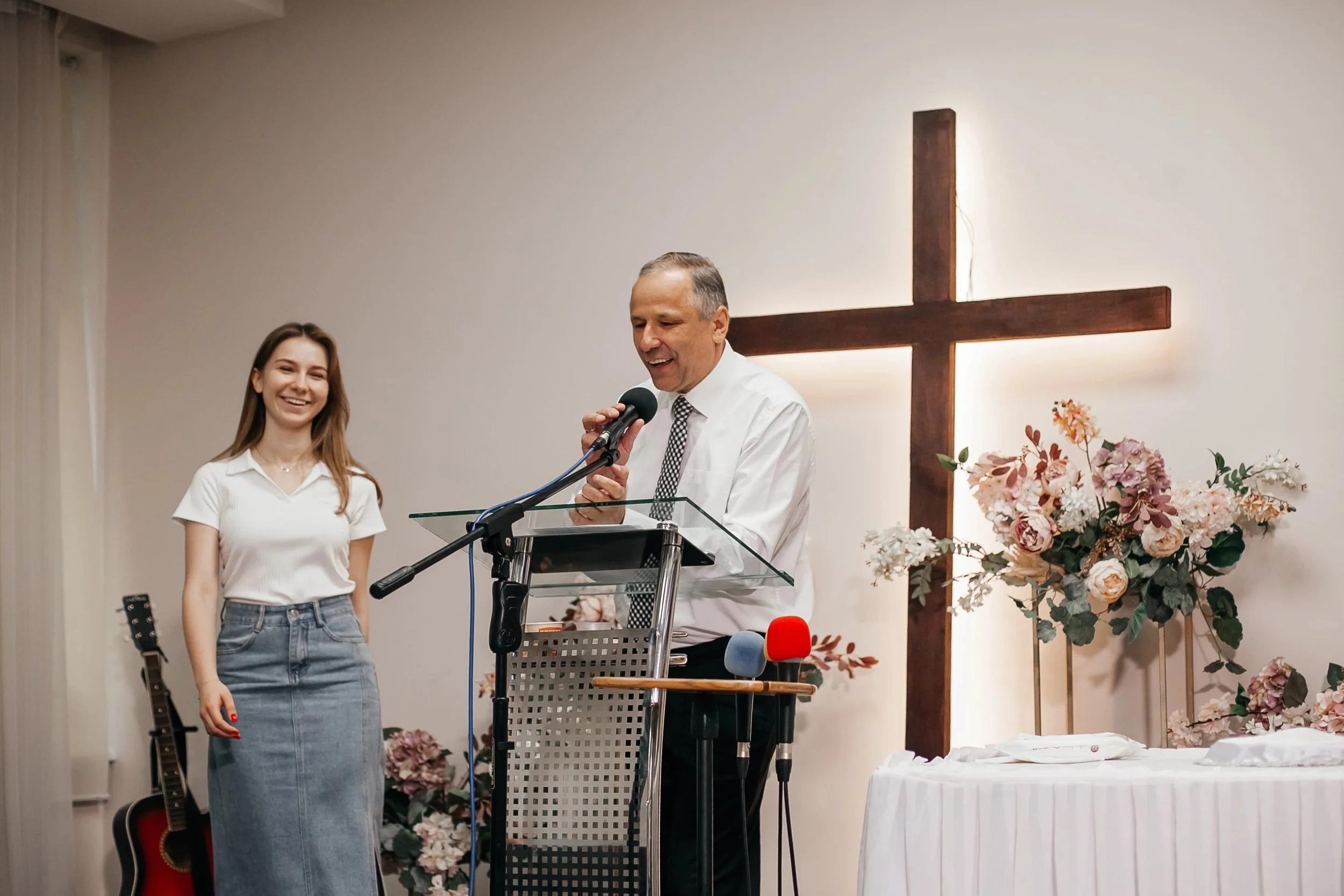
To build trust, we used real photos of church members throughout the site—no stock images. This added warmth and authenticity, making the space feel personal and safe.
Reusable components like event cards, quote blocks, and videos ensured consistency across pages. The design aimed not to impress, but to invite and connect.

Prototyping & Testing:
I built a clickable prototype in Figma and shared it with both leadership and a test group of users.
Feedback was overwhelmingly positive:
“It actually feels like our church.”
“I love that I can ask a question without feeling awkward.”
“Finally, I can send this to my friends who are curious.”

Based on this feedback, I made small adjustments to the homepage structure and simplified the blog layout for easier reading on mobile.
Reflection:
This project reminded me of the power of design not just to communicate—but to connect.
What went well:
The anonymous Q&A feature turned out to be more impactful than expected. It made the site feel human and safe.
The church leadership felt truly represented by the digital presence—and they could now share one simple link for everything.
What I’d do differently:
Next time, I’d integrate tools for tracking the types of questions people ask, to help inform future blog content.
I’d also explore integrating live chat or WhatsApp for those seeking direct connection.
What I learned:
That even in the space of faith and humanitarian work, user experience matters deeply. And that modern problems—like digital overwhelm and spiritual confusion—can be solved with honest, thoughtful design.